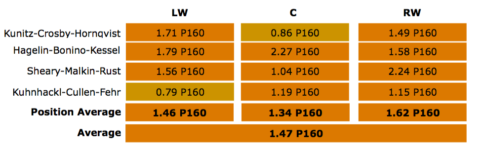
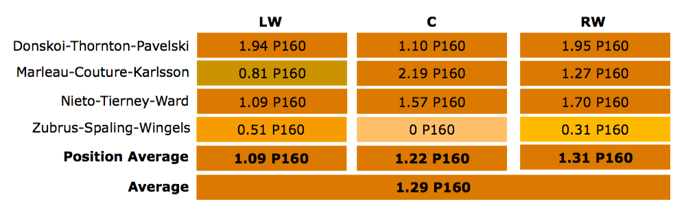
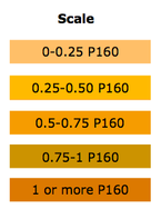
I know I haven't posted in a while, but I've found the time to create a fun new visualization: scoring depth charts. Scoring depth charts involve a colour scale based on primary points per 60 minutes (P160) and line combos. For example, here are scoring depth charts for Pittsburgh and San Jose in the playoffs*, along with the scale.
I'll be playing around some more with this in the offseason, so there will probably be a few more posts about this soon. Thanks for checking it out!
